University Orientation Digital Experience · Digital Design Exercise
2018.
The following is a design challenge completed as part of the hiring process for the Google UX summer internship program. My project responds to Option 2 of the prompt (see lower). The final screens can be observed directly below, followed by a process story that culminates in more specific descriptions of select screens. There's also a much larger image of the screens at the bottom of the page.
Sketch Flinto Video Editing Illustrator Premiere
Primer Prompt
Option 2
Design an experience for students to discover orientation events and craft a visual system to accommodate different types of events: sports, music, visual arts, social groups, and volunteering events. Provide high-fidelity mocks for searching, browsing, and viewing the details for these different events.
Define The Problem Research
Orientation is an exciting but oftentimes difficult experience for incoming college students. I myself recently went through a college orientation, having moved to Paris for the Spring semester. The experience brought back memories of freshman year, and left me lost, confused, and overall disconnected from other students and the college itself.
What makes Orientation such a uniquely confusing time, and how can digital experiences not replace, but enhance our experience, and connect us more effectively with the school we are about to attend? I conducted interviews with students who were in similar situations to me here in Paris for school, as well as recollect with fellow students about the issues and friction points we faced during our original frehsman orientation.
Pain Points
Some of the main points of friction in previous experiences with orientation:
- - Info not all consolidated in one place
- - "I don't trust 'searching' for events
- - Viewing saved content requires multi-stepped process and backtracking
- - "They either show too much or too little"
- - Lack of similar schedules causes distrust amongst students that their digital tools are in fact guiding them correctly
Wants and Needs
The following are common needs based off of my interviews:
- + Consolidated browsing and saving
- + Float content to user rather than hide behind searches
- + Contempory design that doesn't "seem like its trying to get me lost"
- + Should feel personal and trustworthy
Demographic
My demographic is freshman-aged incoming students, who are new to the school and the area around it. As my interviews primarily consisted of students from my own school, the school I am designing for is The New School in NYC.
Define The Desired Outcome Goal
Keeping in mind the information above, the experience I am creating should be empathetic to the user, and feel concise, frictionless, and trustworthy. Designed as a responsive web application, the organisation of the experience lifts information to the user, rather than relying on tiresome digging and re-routing.
Overall, the goal of this project is to limit the amount of time a user has to spend in the experience, with the mindset that orientation can be improved by connecting students to each other and the school, rather than becoming lost in a digital ether. The visuals should be clear and readable, and should highlight and elevate the Events, the stars of the show.
Design Process Prototype, Test, Iterate, Rinse and Repeat...
Given the time constraints of the prompt, the project lent itself to rapid prototyping, using constant communication with potential users to guide my designs. Leaning on popular design thinking models, my design process was very much centred around quickly receiving and iterating to user feedback, before testing and repeating the process.
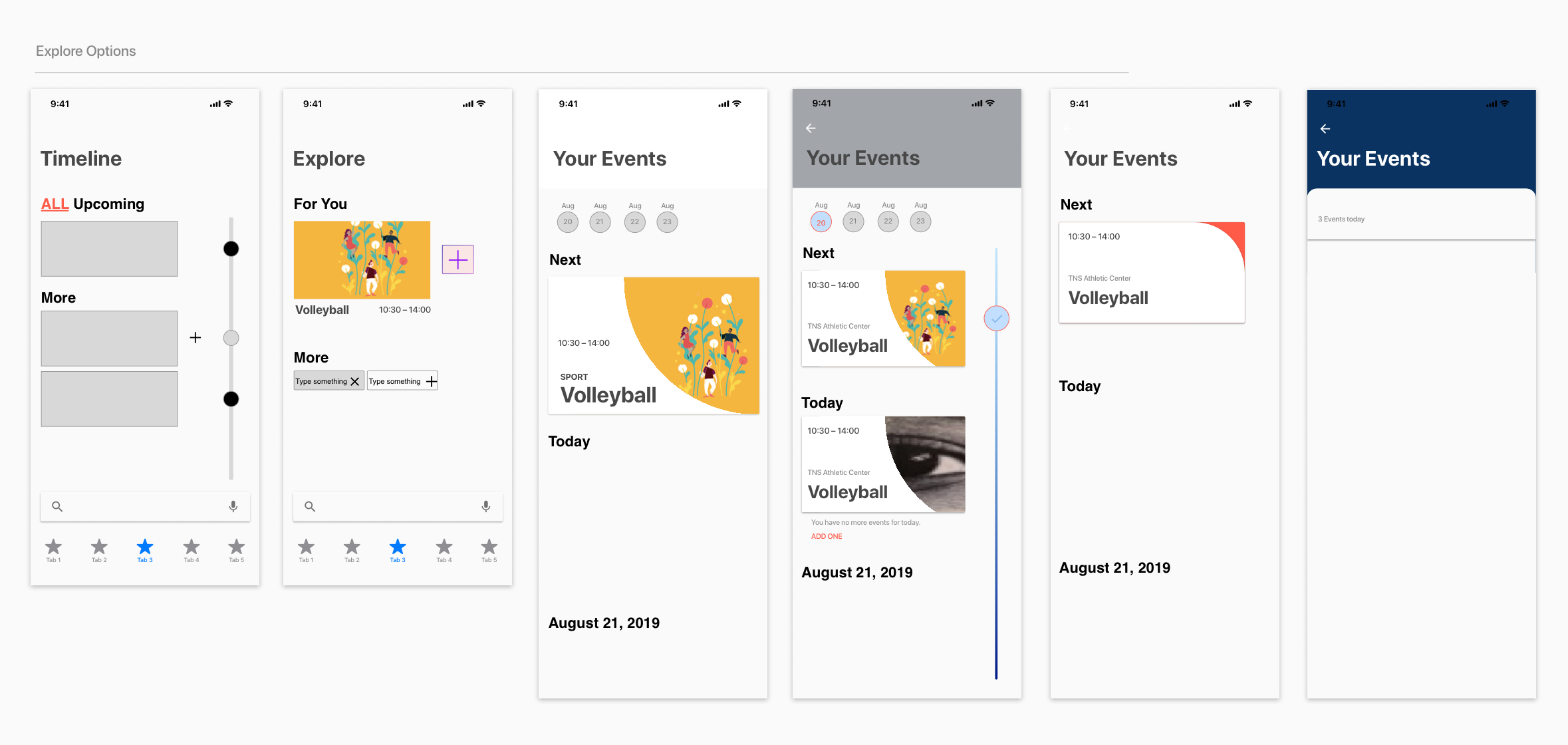
Multiple options for all potential pages were shared and critiqued amongst fellow design students and potential users. As shown in the above image, one of my main one of my main focusses was centred around how to partition pages; how do we create consistent languages and flows that reinforce one another but don’t feel repetitive?
Additionally, I explored multiple models for timelines and searching for information, striking a balance between glanceable, evaluated information, and easily accessible granularity and focus.
The developed wireframe reflects a distillation of information; partitioning the application into three core sections (home, explore, your events), with simple headers and cards providing legible hierarchies that guide, but don’t constrain the user.
Styles and Elements Design System
Visually, the app is designed to feel familiar, yet energised and fluid. The UI is sparse but not meagre, once again the visual design is supposed to be legible at a glance, and elevate events over all else.
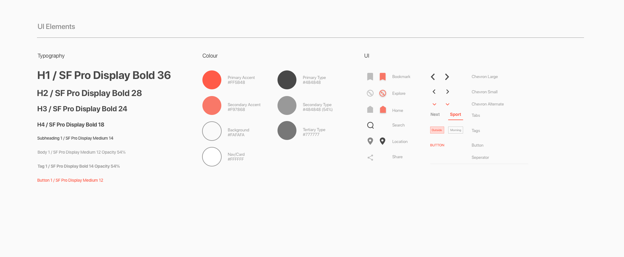
Soft and distinct reds evoke confidence and help to seperate elements. San Francisco is coherent sans-serif type that was designed specifically for digital, and holds up on the smaller screens most students will be using when mobile during orientation.
The app’s visual language leans heavily into the navigation, this being primarily a browse/discover experience. Large headers and tabs cue the user to explore with confidence and purpose. Material Design principles informed much of my design work; the cards and menus help to create a pattern that provides the user with hierarchies and units they can quickly acclimate to and use efficiently.
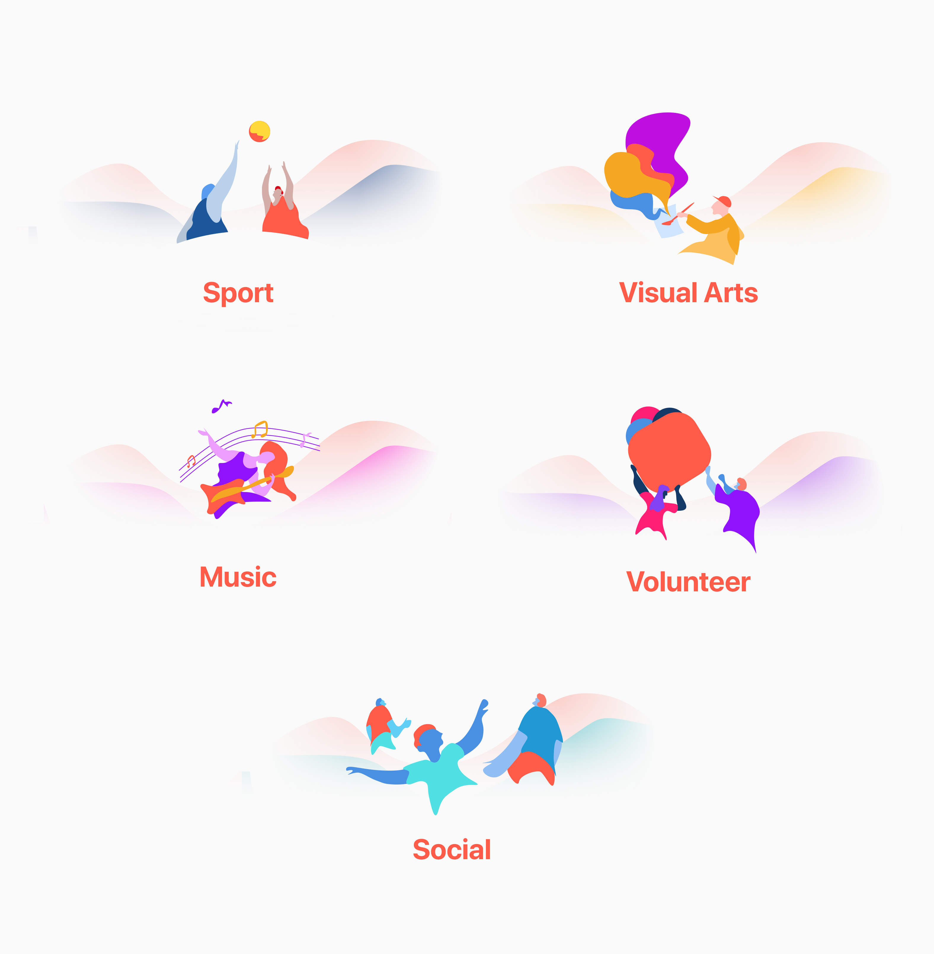
Event Category Graphics
Whilst familiarity is a fundamental aspect to my design, I needed a way to create distinct separation and categorisation of events. Iconography has become an abstracted trend recently, and oftentimes is missued or just becomes a glorified bullet-point to a piece of type.
These simple graphics maintain unity but help to visually remind the user of the type of content they are looking at, reinforcing order in an energetic manner without disrupting the learned system of navigation in the experience.
Bringing it to Life Motion and Detail
Motion is used to help reinforce the app’s behaviours and flows. By using simple movements and animations, the user is provided not only with a more visually stimulating experience, but one that continues to make itself more clear with every swipe and tap.
Current Iteration Hi-Fi Mocks
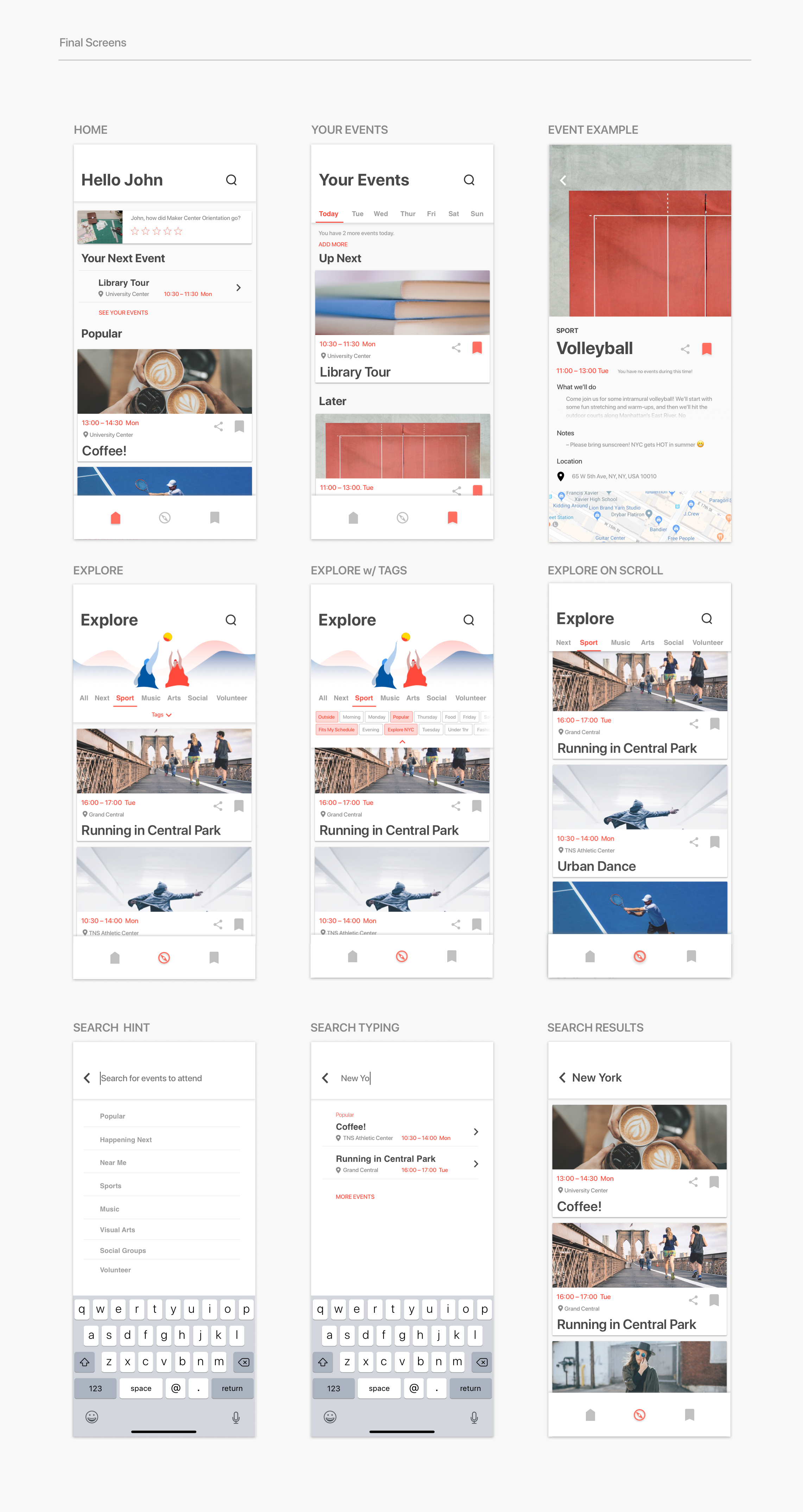
Final Screens Below.
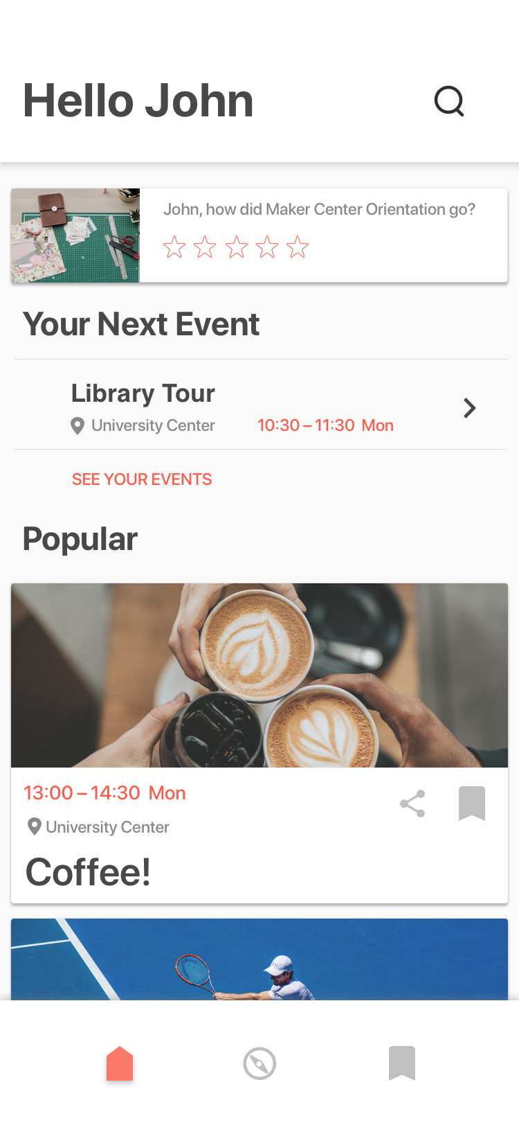
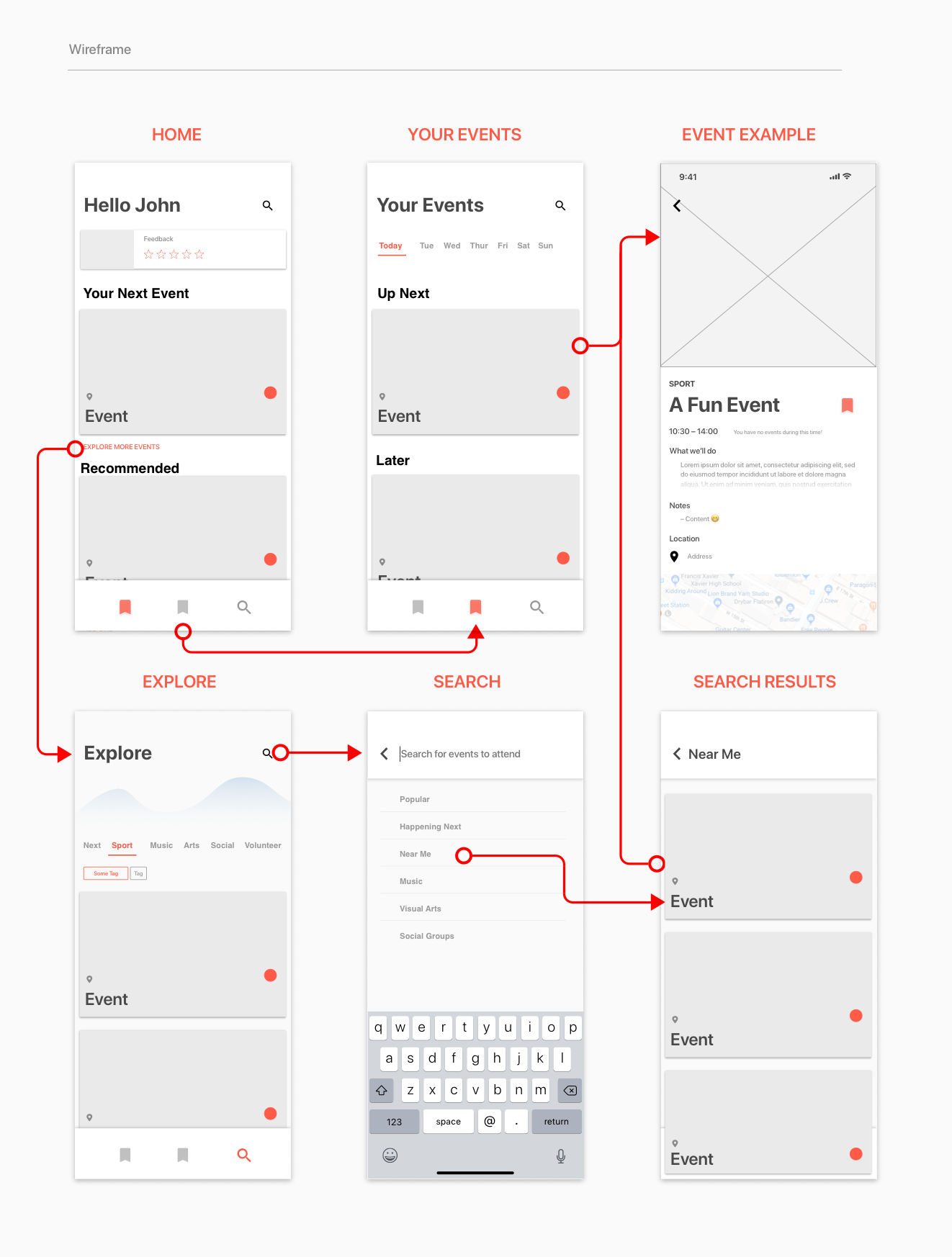
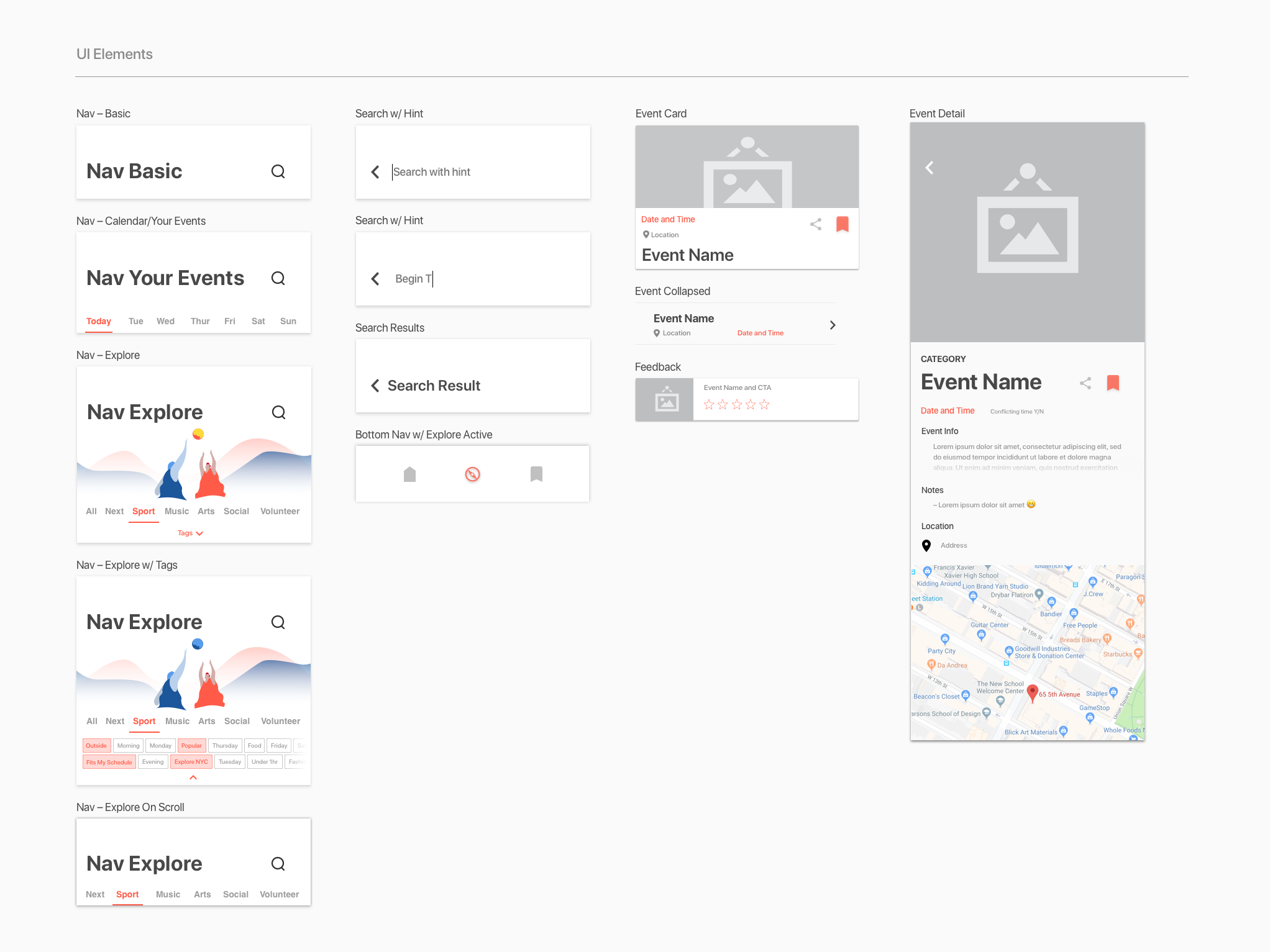
Home Page
The Home page provides a landing site for the user that distills the rest of the application into one place. A search button allows for more direct inquires into events. The user’s next event is seen in the centre of the page, followed by recommended and popular events that the user is invited to look into.
A feedback card of the user’s previous event is also displayed; providing the school with feedback and giving the user a larger feeling of agency in their experience.
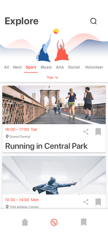
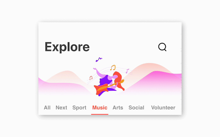
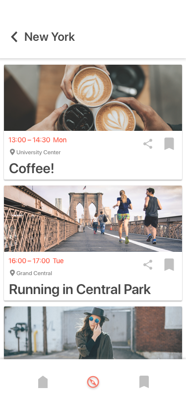
Browsing Events
Browsing events is done through eh explore page, accessed centrally at the bottom nav. Explore is the fundamental piece of the app. Users can view events as cards by scrolling through All, or by choosing a more specific category. Further granularity is provided by selecting from a number of tags.
The goal of the Explore page is to provide users with direct events easily, and then on-request to give more detailed information, or more detailed ways to search for specific events. Rather than demanding a user to search from the start, Explore doesn’t thwart or strangle discovery and exploration.
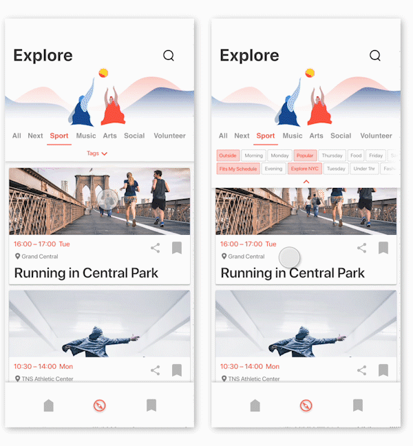
To the right is a demonstration of movement between different sections, as well as using the tag system.
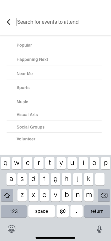
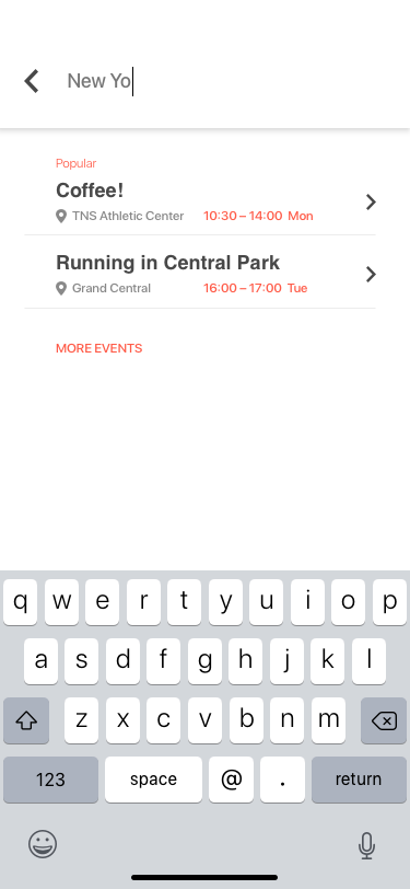
Searching Events
Whilst the design of the app hopes to alleviate the need to make direct searches, giving the users agency and specificity is equally important when designing for oftentimes stressful or busy schedules. The search feature provides a number of hints and categories to prompt the user to type or tap what they desire. Upon typing, the user is recommended relevant events, as well as a page of related events upon properly ‘searching.’
Demonstration of 'pushing' deeper into a search, including recommended events and search results.
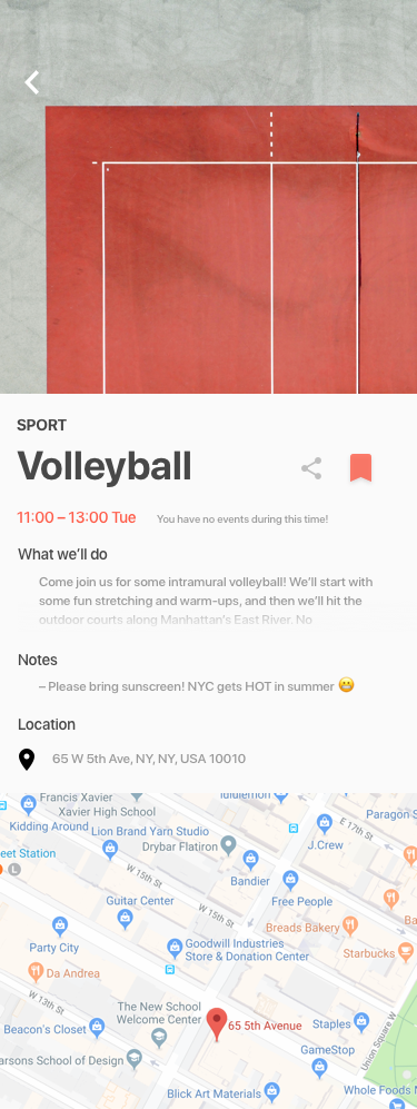
Viewing an Event
Events are usually shown as cards, with the most relevant information provided alongside a photo. This makes it easy to distinguish between events, and quickly ‘flip’ through them., as well as sign-up.
However, more information can be gleamed by simply tapping into one, and reading the extended information. Here, as before, users can sign-up and share the event, but also can see directions and other notes. Opacity is used to imply more information, allowing other vital contents such as an integrated map to be viewed on-tap, rather than though additional scrolling.
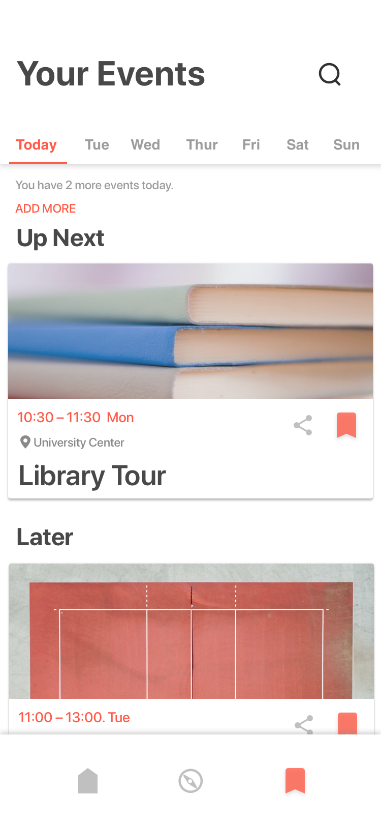
Viewing Your Saved Events
Finally, the user has a personalised page to view their saved events away from the rest. The user is also given a set of tabs that help split their events by date. Whilst forcing a user to view an entire calendar for an orientation that usually only lasts a week is impractical, being able to plan and see your schedule was necessary to many of the potential users interviewed.
See a massive image of the screens below.